Sunday, December 11, 2011

YouTube Re-Design Video Manager

Management makes the videos more simple and less interference


The YouTube yesterday the introduction of some amendments to the management program video or what is known as Video Manager, which is the update that coincides with the location for the design of an entirely different earlier this month.

As is the case with the new design for the YouTube Home Page, become a management tool video clips more simple and less interference. It also became a support and a smoother user interface appropriate to the Google system, which facilitates the process of browsing and navigation.

He has published the Working Group on Active blog by a group of major changes witnessed by the Video manager; notably:

- Icons to indicate the specific situation to identify and order status updates published.

- Badges to identify quickly sections of high quality and business protected by copyright.

- An easier way to raise the video clips directly from the sidebar.

The new design tends to make the management of video clips on YouTube is less chaotic than ever before. As they make clear the company's goal to create a design language is consistent with all the features of Google.
 

News of the launch of a Samsung Galaxy Tab 11.6 in February 2012

The first device to the tablet screen Retina Display


Sources close to Samsung for BGR exclusively to the giant Korean attend strongly to defeat Apple in the hardware market tablet through the introduction of the first Tablet screen Retina Display, has Ergeht sources that the new agency will carry the name of the Galaxy Tab 11.6 and will be launched within the exhibition Mobile World Congress in the month of February.

The site showed BGR, according to sources, that the alleged will enjoy the screen Retina Display size 11.6-inch provides the clarity of a stunning degree of 1600 × 2560 pixels and the aspect ratio 10:16, as it is expected that the device is first powered devices processor Exynos 5250 dual speed 2GHz, a processor that recently unveiled by Samsung, in addition to the benefit of the Ice Cream Sandwich version of the Android system.

The sources close to not reveal the details of the capabilities of communication or the capacity of internal storage, but it is likely that they will not under any circumstances for properties that have been presented in the Galaxy Tab 10.1, has rejected Samsung's official comment on the speculation, to give more of the mystery and excitement on the recent news.

Saturday, December 10, 2011

Most Facebook Users are Wary of The Messages Tab "Hidden"

  • Contribute to hide a lot of messages collective.


Across many Facebook users expressed dissatisfaction with the sub-tab Other tab General Messages Messages and which contributes indirectly to hide a lot of messages which cause the collective anger and dissatisfaction with users of Facebook on a large scale.

The Facebook site has provided property Other tab General Messages for several months but did not attract the attention of a wide range of users only recently, but that many users did not notice its presence until now, and aims Facebook this tab sub to collect the messages that it deems less important for the user , and often messages are private occasions or persons have no direct relationship to the user, but in some cases may cause problems for the user, most notably what happened to correspondence site Slate, which reached her a letter from a man who does not know knows that he has found the apparatus laptop missing, but the Facebook class the message within the Other tab to another a lot of organ retrieval.

Mashable was the site of the technical specialist has recently decided to work a poll for visitors and those who follow news on Twitter about the property Other, and in spite of the poll still exists so far, the majority of users expressed their discontent with the full on the property.

HP decided to maintain the WebOS Open Source Project


Attempt to occupy third place after Android and iOS


HP's finally reached a final decision on the future of the system, WebOS, which decided to maintain the system, but an open source product, saying it will continue to support the development and operations of the operating system your portable devices.

Explained HP's said it would contribute substantially to the support system WebOS through the window ENYO-operational framework for a system of WebOS-a move that experts expect to contribute to attracting more manufacturers of smart phones that are looking for diversification away from the system Android, which now prefers to wait and see what be provided by companies to develop mobile operating systems in the coming period, and WebOS will support the system in this conflict is the strong sales achieved by the HP TouchPad device, especially after it slashed the price to 99 U.S. dollars.

Experts believe that the direction of HP to transfer the system to run an open source platform may contribute to the superiority of the system of Windows Phone as the third most portable operating system after each of the Android and iOS, given the substantial support from the community will get open source developers around the world.

Study: 29% of The Users of The IPhone 4S is not Satisfied with The Phone

Eight weeks passed since the launch of the device    


Crimson Hexagon company has specialized in data analysis and follow-up and monitoring of social networking news, analysis of nearly 2 million entries relating to smart phone Apple iPhone 4 as on Twitter, in order to identify the users of the device after purchase.
The report, published by the company, that 37% of posts were generally positive, and 29% came from the Entries negative while the percentage of neutral Entries to 34%. Perhaps the reason for concern, is that the proportion of negative reactions is increasing.
Siri was dominated by service on the talks dramatically, and was narrowly Entries for Siri is the most negative rate of 12%, while the positive Entries received for Siri to 11%. The neutral Entries for Siri, was the service assistant sound or what is known in the audio control device, and that this feature does not deal with the users of those dialects well, where there is difficulty in understanding, in many cases.
Perhaps the most concern to Apple, is that the problems of the battery is not over yet, despite the fact that Apple had claimed that the problem was resolved by updating the operating system, Apple iOS 5. The report also noted that 11% of posts talked about draining the battery faster than expected.
It should be noted that the Company Crimson Hexagon was analyzed for posts for your iPhone 4S in the middle of last November, and was only 7% are for those who have bad impressions of the phone battery.


Google Activate a Feature on The Face Recognition on Google Plus

New update adds the social character of Gmail


Google announced today the activation of face recognition service automatically on Google's social network in place.

And allow the new feature launched by Google Name Find my face facial recognition and the reference to people in the pictures, the condition of this property.

And it seems that Google has learned a lesson from the harsh reactions obtained by Facebook users and the European Union, because of the facial recognition feature is on by default. Therefore, Google allows you to place control of this property through the acceptance or rejection of any marking or indication to the user in any form, users can also enable or disable the property.

It is scheduled to activate the feature and the launch of Find my face to the users during the next few days. In the same vein, Google has updated the service Gmail and add two features new give it the character of social networks, which would facilitate the process of adding people to the circuits for the network Google Plus through Gmail, as well as the possibility of exchanging files and links on the Google Plus without having to leave the mail.

In addition, messages can filter incoming mail based on Google Plus services, for example, the user can see the messages for the family or co-worker or any other group was allocated a circle.

Wednesday, September 28, 2011

AVG Anti-Virus Free Edition 2012


The bottom line: AVG Free 2012's renewed focus on performance keeps scans zippy, but struggles with slowing down your boot time and too many false positives.
Review:
The never-ending mantra chanted by security suite vendors sounds a lot like "faster scans, easier to use, better performance," and AVG has released a new version that it says accomplishes all three. Certainly, the scans are faster, it does install more quickly, and some tweaks to the interface have made it easier to view. Two new core security changes will make you safer, too.

Download Now (3.72MB)


Installation
We found that the program can go from completed download to ready to use in about 5 minutes.
Last year, AVG cut down the number of installation screens from 13 to 5. This year, the process continues to be short, but savvy users will want to be wary of a few things. First, if you have a browser open when installing, AVG will not warn you before it forces it to close. Second, you are opted-in to AVG's Security Toolbar and the Secure Search default search engine change. Users who opt out of installing the toolbar but want it later will need to rerun the installer to get it.
On the polite side, AVG does not opt you in to an automatic AVG Internet Security trial. By starting from a null position, you are required to actively choose to install AVG Free or the 30-day trial of AVG Internet Security. So this year's install procedure is a bit of a crapshoot, better in some ways than last year, but unchanged in others.
Interface
The changes to AVG's interface in the 2011 version were minor but actually improved usability quite a bit. This year, the tweaks are even less pronounced. There's not much different besides redoing the icons in the main interface so they're easier on your eyes.


AVG Free's slightly tweaked interface for 2012.
(Credit: Screenshot by Seth Rosenblatt/CNET)
There's a one-click Fix button for automatically repairing security breaches that appears at the top along with a yellow X when your system safety has been compromised. It disappears when your system gets a clean bill of health.
Joining the one-click Update button on the side nav is a one-click Scan Now button. There's a clean look to the nav, as well, with bigger fonts and timestamps for the most recent scan and most recent update.
AVG has placed icons for its security components in a central pane. Double-click on one to access more information and basic configuration settings for each specific tool. Advanced settings are available under Tools on the menu bar at the top of the window.
The new interface changes are small, no doubt, but they do make AVG easier to use.
Features and support
AVG 2012 includes a couple of solid changes to make you safer. The first is a patent-pending technique for identifying one of the most obnoxious threats to ever reach your computer: the fake antivirus. If you're unfamiliar, these programs purport to be an antivirus, or a Web-based antivirus scan. Once they install on your computer, the only way to get rid of the infection is to "buy" their license. They're also related to the ransomware infections, which don't even bother with the effort to pretend to be an antivirus. AVG 2012 will block both of them.
The LinkScanner tool has been improved to watch out for more dynamic code, which is essential in the security game because threats are mutating at such a rapid rate. Meanwhile, premium users get the new AVG Accelerator option, which optimizes your Internet connection to speed up downloads and rendering. It currently works on two sites: YouTube, and you can see its impact when pausing and unpausing videos; and Download.com binary downloads. The accelerator protocol was developed internally at AVG.
AVG now includes a monitoring tool that automatically warns you when Firefox, Chrome, or Internet Explorer consumes too much memory. Called AVG Advisor and in all of the AVG suites, it opens a small pop-up and asks you if you'd like to restart your browser. There's no way to "force" it to activate, although if you open up a couple dozen tabs, wait a few minutes, and then open another dozen or so, it ought to kick in.
Changes made last year are still relevant. The software offers what it calls "smart scanning," which leverages AVG's behavioral detection network to scan known safe files once, and only rescan them if it detects changes. As with its competitors, AVG's network is made up of its user base anonymously contributing data up to the cloud. You can choose to opt out of contributing your data when you install, or from the options menu. AVG says opting out won't negatively affect your security.
The smart scanning tech also gives you a built-in system resource manager that prioritizes scans. If a scan is scheduled to begin while the computer is in use, it will automatically restrict the scan so that it runs slower but doesn't interfere with the computer's other tasks. When it detects the computer idling, it will then allocate more power to the scan. The feature comes with a slider so you can customize how sensitive it is.
The desktop gadget for Windows Vista and Windows 7 users that lets them initiate scans and updates with one click, without having to open the full interface. It also contains links to AVG's Twitter and Facebook pages, which the company uses to bolster its support for the free version.
The PC Analyzer scans your system for Registry and disk errors. It includes a disk defragmenter and a broken-shortcut cleaner, as well. Although the feature is restricted in full to paid users, if you have the free version, the PC Analyzer comes with a one-time offer to clean all errors it finds. It provides a link to download the separate PC Analyzer tool, once the scan is completed. This is an interesting twist on the idea of letting users detect but not repair errors, and it provides more functionality while not affecting the basic security of your computer. However, it's likely that some users will shy away from the extra download.
Other features are restricted to users of AVG's paid upgrades. The paid upgrade version of AVG Anti-Virus 2012 distinguishes itself by offering chat link shield, a download scan for files sent via instant message that looks at all ports, not just port 80, and telephone support 24 hours a day, seven days a week. The PC Analyzer option mentioned earlier is also included, and comes without restrictions. New in 2012 to premium users is the new AVG Accelerator option, which optimizes your Internet connection to speed up downloads and rendering. It currently works on two sites: YouTube, and you can see its impact when pausing and unpausing videos; and Download.com binary downloads. The accelerator protocol was developed internally at AVG.
AVG Internet Security 2012 includes all that AVG Anti-Virus 2012 offers, and adds in a firewall and antispam protections.
Performance
AVG claims some major performance enhancements in the 2012 versions. Specifically, the company says that it has reduced by 40 percent the size on your hard drive of the virus signature database. That database is a major component of how the program recognizes threats. AVG also stated that the number of running processes that run suite has been reduced from 16 to 11, that it uses 20 percent less memory overall than previous versions, and that it ought to impact your computer's boot time less.
CNET Labs' benchmarks found that, on the whole, it is a faster program than last year's. However, we can't directly compare this year's results to last year's because we upgraded our testing computer from Windows 7 x64 to Windows 7 x64 with Service Pack 1. We can report that AVG's boot time impact was slower than average, ranging from 2 seconds slower than the average suite from AVG Free to 18 seconds slower than average for AVG Anti-Virus. AVG Internet Security was a few seconds slower than AVG Free. This is not unusual for AVG, as it historically has a big impact on startup, but that doesn't mean we don't want to see it get faster.
Shutdown impact continued to be minimal. Security scan times were the third-fastest suite we've seen so far year, though not as good as last year's tied-for-fastest numbers. The impact of the suites on the computer while in use were very similar to last year's--in general, slightly better than average, but not stellar.
Security Program Boot time Shutdown time Scan time MS Office performance iTunes decoding Media multitasking Cinebench
Unprotected system 40 6 n/a 395 120 342 17,711
Average of all tested systems (to date) 64.3 16.6 1,185 418 125 348 17,111
AVG Anti-Virus Free 2012 66.3 12 753 411 125 347 17,131
AVG Anti-Virus 2012 82.3 13.7 842 410 124 346 17,026
AVG Internet Security 2012 69.9 11.3 792 416 124 344 17,259

*All tests measured in seconds, except for Cinebench. On the Cinebench test, the higher number is better.
In our other tests, it was a bit faster than the median. It's not a big shift from last year, but it's enough to notice that it's moving in the right direction. You're looking at a much slower startup, fast scans, a minimal impact on shutdown, and a midrange hit to general system performance with AVG Free.
Third-party efficacy results haven't been published yet for AVG Anti-Virus Free 2012, but the 2011 suite marks are solid, if not spectacular. In the AV-Test.org test on Windows 7 from the first quarter of 2011, AVG Internet Security 10 (version 2011) scored 13.5 out of 18 overall, a solid midrange score. The suite had a 5.0 rating out of 6 in Protection, a 4.0 in Repair and a 4.5 in Usability.
The second quarter 2011 test, on a Windows XP computer, definitely showed improvement in some areas and regression in others. It scored 13.0 out of 18 overall, also a midrange score. The suite improved in Protection and Repair with a 5.5 rating out of 6 for the former and a 4.5 for the latter, but Usability dropped to 3.5 most likely due to false positives.
The most recent AV-Comparatives.org Whole Product test, which looks at on-demand scanning, retroactive tests, and "real-world" guards including cloud-based protections, puts AVG Internet Security 2011 toward the back of the class, out of 17 suites tested. Looking at Whole Product test results cumulatively from January 2011 to June 2011 found that AVG came in 13th, blocking 95.1 percent of threats. Much of that low score came from bad showings in March and April; by May it was back up in the 96 percent range.
It's fair to conclude that according to these third-party tests, AVG has been moderately effective, with some indications that it's been getting better in recent months. However, since AVG Internet Security and AVG Anti-Virus Free share the same engine, you're getting a strong level of protection at no cost.
Conclusion
A word of caution: We've noted before that the average person is paying more and more attention to performance, and there are far more viable operating system options than ever before. If security is more or less similar, people will be scrutinizing system impact greatly, and adding 30 seconds or more to your boot time has the potential to drive people not just from your security suite, but from your OS, too.
All that said, AVG Anti-Virus Free continues to offer an excellent if not perfect level of security, and is well-worth a serious shot at being your go-to suite.


Reviewed by: Seth Rosenblatt
Read more: CNET Download


New Google SIM Card With Nexus S | In Spain


All right. What we have here – a Google branded SIM card with an S. Nexus

According to a Spanish site – Engadget Android, Google can be tested by giving some of the engineers of these cards and Nexus S, as shown in the picture below. It seems real, very well.

And here is another thing. If you look closely in below pictures, you’ll notice is a person showing – Google_Es. Now it is quite easy to change the brand carriers, but once again, are the SIM cards described above seem quite ok.


This should not be entirely true, it is taken with a pinch of salt. In addition, the source said that Google could become a virtual operator and the work, either with or Pepephone Simyo – telecom operators in Spain.


Hmm, sounds interesting. If Google is really looking to translate their voice service for the carrier, which may be large. Very, very large


Source: Tech Absolute

Elusive Laser Watch Concept | in Future


The elusive concept of Watch took the form of an internship at Dassault Systèmes, because we fully support the newcomers. Yes, it is minimalist, but also actually quite functional, and makes much sense. The heart of all time, it is planning your skin using lasers. The overall effect is futuristic and saves energy when you only have access to “time” when you need it. Otherwise it’s a pretty nifty-looking strap.


Source:Tech Absolute


Thursday, September 22, 2011

Buy The Smallest Camera in The World Now


Hammacher Schlemmer now sells what it claims to be the world's smallest camera for $100. The miniature digicam is small enough to rest on a finger, measuring 1.125 inches long, 1 inch wide and 1.062 inches deep.
It's not a terrible camera for its size, either, with a 2-megapixel sensor that captures 1600-by-1200 resolution photos with auto-focus, or 30 frames per second AVI video in 640-by-480 resolution. A 2 GB microSD card is built in, and there's a USB port for transferring photos to a PC. The built-in rechargeable battery gets 30 minutes of use per charge.
But is the "World's Smallest Camera" really the world's smallest? As Engadget notes, JTT's Chobi Cam One is actually smaller in volume at 0.934 cubic inches, compared with 1.195 cubic inches for the Hammacher Schlemmer camera.
The Super Small Spy Digital DC DV, available at Brando, also trumps the "World's Smallest Camera" with a volume of 1.102 cubic inches.
Some spy cameras, like the one sold by SpyVille, are even smaller, though they must be attached to an external battery. And if you exit the world of consumer tech, you'll find cameras like the NanEye 2B, which is smaller than a matchstick head and is meant for medical use.
So with all due respect to Hammacher Schlemmer, its claim to the "World's Smallest Camera" doesn't hold up. We'll give it extra points for cuteness, though.

By Jared Newman, PCWorld  
Source: PCWorld

Convert Videos From 2D-to-3D On YouTube By New Conversion Tool

YouTube wants to improve on the lack of 3D content, which is one of the main barriers stopping mass adoption of the technology. The video streaming site is now making it easier for anyone to create 3D video content, without the need for special cameras, with a beta 2D to 3D conversion tool.
Three-dimensional videos on YouTube are not new. The site allowed filmmakers to upload video in 3D, but they had to set up two cameras and combine the footage using special software -- a tricky and time-consuming task. The new 2D to 3D conversion tool is a much handier alternative for the average user.

YouTube’s 2D to 3D conversion tool turns any 2D video into a 3D film with the click of a button after upload. The feature can be found by selecting "Edit Info," then "3D Video" on a video you've uploaded. YouTube product manager Shenaz Zack Mistry said in a blog post that users will “still get best results with a 3D camera, but it's a great new way to let people enjoy your finest moments.” You’ll also still need 3D glasses to enjoy the converted clips.
YouTube also introduced two new software tools for amateur moviemakers to spice up their home movie productions. The first tool is called Magisto, which is an automated video editor (found in the video toolbox) that claims to find the best scenes in your video and assembles them with music and effects (fades, transitions) for short clips. The second tool is called Vlix, which lets you add various effects and text at the beginning and end of a video.
To top it all off, YouTube announced that users who go through a complete account verification (includes giving the site your phone number) and haven’t breached any copyright rules (such as using popular songs as music backgrounds in their videos) will be allowed to exceed the 15-minute upload limit.
 
By Daniel Ionescu, PCWorld

Source:PCWorld

Within Two Weeks : Windows Phone 7 'Mango' will Arrive

Microsoft will begin delivering the new version of Windows Phone 7, code-named Mango, to its customers within the next two weeks, the company announced Wednesday.
"For months, we and dozens of our partner companies have been laying the groundwork for the Windows Phone 7.5 update--and making solid progress. As a result, we now expect to start rolling it out in the next week or two," writes Microsoft's Eric Hautala, general manager of customer experience engineering for Windows Phone, in a Sept. 21 Windows Phone Blog post.

Why Mango Matters
Windows Phone 7.5 (WP7) brings dozens of new features to Microsoft's mobile OS, which needs a refresh to stay competitive with Apple's iPhone and Google's Android platforms.
Mango's Start screen now let users create personalized live tiles for their friends or groups. And the updated People Hub provides a single interface for Facebook, LinkedIn, Outlook, Twitter, and Windows Live Messenger updates, saving users from having to switch between apps.
Mango has tighter integration with Skydrive, Microsoft's cloud storage service. For instance, Office users now can access SkyDrive via the Office hub, and can pin Office documents to the Start screen--a feature reminiscent of the Windows desktop.
Other Mango enhancements include browser support for HTML 5 and hardware-accelerated graphics, as well as YouTube, LastFM, and Slacker integration with Windows Phone's Music + Videos hub.

Bootleggers Beware

Version 7.5 updates will be paired with software updates from handset manufacturers, and Microsoft is advising Windows Phone 7 users to avoid bootleg copies of Mango.
"This matched and paired firmware has been painstakingly tuned so your phone--and apps--work with all the new features of Windows Phone 7.5. Since your phone requires the proper firmware to function as designed, my advice is simple: steer clear of bootleg updates and homebrew tools," writes Hautala.

Microsoft issued a similar warning in April, when it warned WP7 users to avoid an unauthorized tool for downloading two software updates.

In conjunction with the Windows Phone 7.5 rollout, Microsoft will refresh its Where’s My Phone Update? table to give WP7 handset users a better idea of when Mango will arrive.


Samsung Galaxy S II Lands on AT&T October 2

AT&T customers are getting some galactic love with the arrival of the Samsung Galaxy S II on the carrier’s “4G” HSPA+ network. The Samsung Galaxy S II has been out in Europe for a few months now and the Sprint version, the Epic Touch 4G, has been out since September 16.
The Samsung Epic Touch 4G is currently the top ranked phone on our Top 10 Phones chart due to its speediness, stunning display and its incredibly thin design. You can expect those same qualities from the AT&T Galaxy S II. Like its CDMA brother, the AT&T Galaxy S II has a 1.2GHz processor, runs Android 2.3, has an 8-megapixel camera with video capture up to 1080p with a front-facing 2-megapixel camera for video chat and a Super AMOLED Plus display. It also has HDMI-out for streaming HD content (up to 1080p) on your HDTV. The HDMI connector will be sold separately. It also runs the latest version of TouchWiz, Samsung’s custom skin for Android, which you can read about in our review of the European Galaxy S II.
The AT&T Galaxy S II has a slightly smaller display than the Epic Touch 4G (4.3 inches compared to 4.5 inches). My colleague, Melanie Pinola, got her hands on the AT&T version at the Galaxy S II US launch event and remarked that its design felt a bit more refined than the Epic Touch 4G.
We’ll be reviewing the AT&T Galaxy S II in the next coming days so stay tuned for a full rated review. 


A Deep Dive Into Windows 8 All About it

After spending several days with the Developer Preview of Windows 8 on a PC, it's clear that Microsoft's new operating system -- which offers two separate interfaces, Metro and Desktop -- is a transitional one between traditional computers and mobile devices. All of Microsoft's energy and creativity has been devoted to the new Metro interface; there's very little new of note for the old-fashioned Desktop.
As I tested Windows 8, I found myself wanting to use it on a tablet instead of my PC, because the big-tiled Metro was so much more visually appealing than the traditional Desktop, with a more intriguing feature set. After using Windows 8 for some time, it's clear that Metro is the future of Windows, and the Desktop the past.
Windows 8: A Deep Dive into the Developer PreviewWindows 8's Metro interface is more visually appealing than the traditional Desktop.
An interesting note: You usually expect developer previews and betas to suffer from performance woes because code hasn't yet been optimized, and bugs may slow things down. However, the Windows 8 Developer Preview is surprisingly fast, even on my aging test machine. I installed it on a dual-boot Dell Inspiron E1505 with 1GB of RAM and a single-core Intel T2400 1.83GHz CPU, which is near the very bottom of the hardware requirements for Windows 8. Yet I found it to be extremely fast and responsive. In fact, it feels zippier than Windows 7 running on the same machine.
Clearly, Microsoft has done a great deal of work on optimizing Windows 8. There's good reason for that; if it's going to work on a tablet, it needs to be fine-tuned.

Getting used to Metro

When I first started using Windows 8, I was surprised to see that the Desktop was no longer the command central for the operating system. You boot into Metro; Desktop has been relegated to just another app accessible from the Metro screen.
Metro has been clearly designed for tablets. Like Windows Phone 7, Metro's main interface is made up of large colorful tiles, each of which represents a different app and each of which can exhibit changing information, such as the latest news, social networking updates, weather and stocks.
In addition, Metro has a horizontal design, with tiles stretching off the right edge of the screen. On a tablet, you'll swipe to uncover new tiles; on a PC, you're relegated to dragging the bar at the bottom of the screen or clicking navigational arrows. Even after several days of use, I never got used to dragging or clicking to reveal the extra tiles; I longed for a touch screen so I could swipe instead.
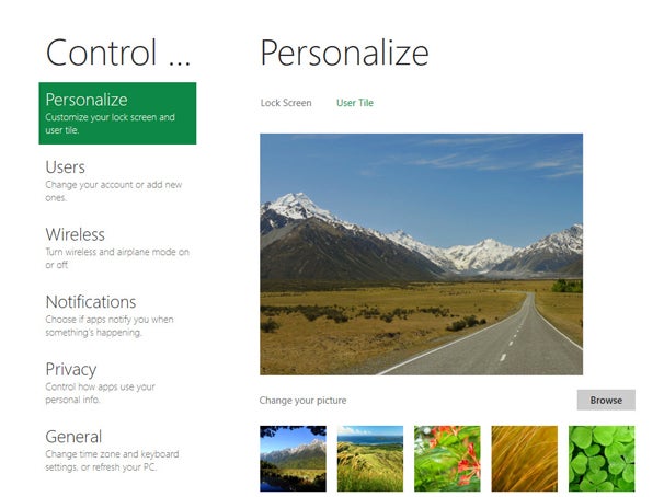
Metro is customizable. You can drag tiles to new locations or customize select parts of the interface via its own Control Panel. You can change the picture on your Lock Screen and your user tile; change user account information; turn wireless on and off; turn on airplane mode and change settings for privacy, search and Windows Update. You can also change your home network settings via HomeGroup (introduced in Windows 7) and your sync settings.
In my initial test of Windows 8, I didn't use Metro that much. But over time I found myself migrating more to Metro when I was actively looking for information. The constantly changing information stream, including news stories, RSS feeds and updates from friends and acquaintances on social networking sites, is quite useful and almost hypnotizing. In Metro, instead of having to seek out information, information comes to you.

Metro apps

Metro apps run full screen like their tablet and Windows Phone 7 counterparts. On a desktop, they take getting used to, because there's no Windows menu -- although after a few days, I became more comfortable using them. You can't change their size or shrink them, though. Switching between them on a PC is kludgy and requires the old Windows standby, Alt-Tab. I eventually discovered another way to do it: Hold the mouse pointer at the far left of the screen until a small icon for the previous app appears and then click to switch to it. All in all, though, Alt-Tab is easier.
Unlike earlier versions of Windows, which had few consumer-level apps built in, Windows 8 offers a plethora. The Metro screen is filled with Microsoft-written games, social networking tools and other apps. They're designed for a tablet or smartphone, although they're usable on a PC as well.
The basic News, Weather and Stock apps are straightforward and simple to use. The News app, for example, offers a list of dozens of RSS news feeds organized by topic, including Business, Design, Entertainment, Lifestyle, Music, Technology and News. Click the ones you want, and they're added to your feed. You can also directly type in the URL of a feed you want to add.
Windows 8: A Deep Dive into the Developer Preview 
The News app offers a list of dozens of RSS news feeds organized by topic. Once you set your apps to grab the data, you'll be able to see constantly changing information in the tiles themselves -- mostly, summaries or headlines -- without having to open the apps. If you see something that interests you, click the tile to be sent straight to that app -- but not necessarily to the specific information you're seeking. For example, when I clicked a headline about the current Republican nomination race on a news tile, I was sent to a page with all the news headlines and had to look for the story. On one occasion, the headline that appeared in the tile wasn't even immediately visible; I had to scroll to find it.

Installing the Windows 8 Developer Preview

To download the Windows 8 Developer Preview, go here: http://msdn.microsoft.com/en-us/windows/apps/br229516
To install it on a PC, you download an .ISO file, burn it to DVD, and then install over a PC with Windows XP, Windows Vista or Windows 7. There are two versions of the 64-bit Windows 8 Developer Preview: one with developer tools, and one without the tools. The 32-bit version of the developer preview doesn't include developer tools. The 64-bit version with developer tools can only be installed as a clean install -- accounts, files and settings on the machine on which you're installing will be deleted.
With the 32-bit and 64-bit versions without developer tools, you'll be able to retain accounts, files and settings if installed over Windows 7 or Windows Vista. You'll be able to retain only accounts and files if you install over Windows XP. As with all previews and betas, the usual caveats apply about not installing it on a production machine.
Installation of the preview is straightforward and requires multiple reboots. On my machine, total installation time (aside from downloading and burning a DVD) took 50 minutes, but it may go faster on faster machines.

 I tried a few other apps as well. The Tweet@rama app is a simple, straightforward front-end to Twitter, and lets you create and read tweets. It's not nearly as useful as a full-fledged Twitter client such as TweetDeck, but for the basics, it's fine. The Socialite app performs similar functions for Facebook. Other apps include a location-based app called NearMe, an app for setting alarms and a paint app called PaintPlay.
One problem with these apps, though, is that there is no standard way to interact with them on a PC. For example, in the News app, right-clicking brings up a context-sensitive menu -- if you're reading a news article you'll get navigation buttons, and if you're on a summary page, you'll get options for adding, refreshing and removing feeds. But if you're in the Zero Gravity game app, right-clicking does nothing. More standardization would be welcome.
Worse yet, there's no clear way to close down many of these apps. For example, Zero Gravity, which features intensely annoying music, doesn't have a menu or any way to shut it down -- so when you switch out of the game to the main Metro interface, the annoying music still plays in the background. Switch to the Desktop or run another Metro app, though, and the music thankfully goes away. In fact, I found that my workaround for closing most Metro apps was switch to the Desktop; after a few minutes, the Metro app I was running typically shut down.

The familiar Windows Desktop

All that being said, when it came to doing actual work such as using MIcrosoft Office, I ended up on the Desktop for the simple reason that that's where the serious applications were.
After you click the Desktop tile on the Metro screen, you'll feel at first as if you never left Windows 7 behind -- the interface looks and works almost identically to Windows 7. You'll see the familiar taskbar across the bottom with taskbar thumbnails, the Notification Panel on the right, the icons on the screen and so on.
Windows 8: A Deep Dive into the Developer Preview 
The search panel slides into place on the right side of the Desktop screen.There are some changes, though. Most noticeable is that the Start button has been thoroughly revamped. Clicking it sends you back to the main Windows Metro screen rather than popping up the familiar Start menu with a search box, folder navigation, a link to the Control Panel and so on. In the Metro interface, however, the Start button functions as a task switcher between the interface and any running apps.
If you want to find your various Windows options, you need to move your mouse pointer to the leftmost bottom corner of the Desktop; a menu pops up that gives you access to Settings, Devices, Share and Search. When you click one of these options, a panel slides into place on the right side of the screen to let you perform the task you've asked it to do. Select Search, for example, and the panel shows a search box, along with a variety of locations where you can search.
The Share button lets you share a screenshot using the Socialite social networking app. The Devices button, designed for printing, playing games and sending content to others, doesn't work in this version of Windows 8. And the Settings button lets you change only the most basic functions of the Desktop.
Windows 8: A Deep Dive into the Developer PreviewMetro's Control Panel also leads you to additional settings for the Desktop.One would expect to find the old Windows standby, the Control Panel, when you click Settings, but no -- instead, you'll have to head back to Metro and click the Control Panel tile, scroll to the bottom of the Metro Control Panel and click "More settings," which takes you to the old Control Panel. If the awkward, time-consuming navigation to get to the Control Panel isn't an indication of how little importance Microsoft attaches to the Desktop, I don't know what is.
There are a few other tweaks. For example, Windows Explorer now has a ribbon interface, a great improvement over its previous version.

Bridging different interfaces

Even after using Windows 8 for some time, I never got used to the dramatic differences between the Metro and Desktop interfaces. It never quite seemed as if it was a single operating system -- instead, it felt like two different OSes bolted together.
Making matters worse is that Metro apps don't show up on the Windows desktop. And although desktop apps appear in Metro, they're so well-hidden you may never realize they're there: With the exception of Internet Explorer, they're stuck all the way on the far right of the tiles so you have to scroll to get to them. And even when you run Desktop apps from Metro, they can't take advantage of Metro's ability to exhibit information via tiles. One hopes that will change in future versions of Windows 8.

Microsoft has made some small attempts to bridge the gaps between the interfaces. Metro and the Desktop share some basic navigation -- for example, in both of them, when you move your mouse to the bottom left of the screen by the Start button, you get the previously described options menu, along with the date and time, and notifications such as whether you're connected to a network and the power state of your computer.
Windows 8: A Deep Dive into the Developer Preview 
When you mouse to the bottom left of the screen, new options appear, along with the time and notifications.This is a good way to try and create commonalities between two very different interfaces, but it doesn't always succeed. In the Metro interface, the options are context sensitive, so when you're in an app and click Settings, for example, the settings will relate to that app. However, if you click Settings on the Desktop the results always pertain to the Desktop, whether or not you're currently using an app.

Windows 8 and the cloud

Windows 8 is clearly being designed with the cloud in mind as well. After installation, you're asked to enter a Windows Live ID, or to sign up for one if you don't already have one. Your Windows 8 machine is then linked to Microsoft's cloud-based Live services, including Windows Live SkyDrive, which is expected to become the central location for your files.
On this Developer Preview running on a PC, however, only a few cloud services were available, something that will likely change in the future. In the Metro interface, when I clicked Control Panel, I found Sync PC Settings, which are designed for a cloud-based world in which people use multiple devices, including Windows-based PCs, tablets and smartphones.
By default, Sync is turned on, which means that your global settings -- such as app settings, screen lock picture and themes, browser settings, taskbar and Windows Explorer settings, and some passwords -- are automatically synced among all your devices. You can decide whether to sync devices that use a metered data plan.
Surprisingly, nowhere could I find settings for automatically syncing actual data and files via Microsoft's cloud http://msdn.microsoft.com/en-us/windows/apps/br229516 service Windows Live SkyDrive. Possibly that will appear in a future Windows 8 version.

Two ways to use Internet Explorer

Windows 8 Developer Preview comes with not one, but two versions of Internet Explorer 10, one for the Metro interface and the other for Desktop. The underlying engine, which supports CSS3, HTML5 and Flash, is the same for both, but the surrounding interface is dramatically different.
Windows 8: A Deep Dive into the Developer PreviewWindows 8 has two versions of Internet Explorer 10. The version shown here is the Metro version, designed for tablets.In the Metro version, you browse full screen, with no controls immediately visible for typing in a URL, adding bookmarks, refreshing a Web page or switching between tabs. Right-click anywhere on the page, though, and those controls appear at the top and bottom of the screen. The top of the screen shows clickable thumbnails of all open tabs. You click on the X to close the tab and click the + to open a new tab, at which point a screen appears that shows pages that you frequently visit, as well as sites that you've pinned so that they're always visible whenever you open a new tab. These pinned sites also appear on the main Metro interface.
The Address Bar appears at the bottom of the screen when you right-click; it lets see your current URL and typing in a different one, go forward or back, refresh the current page, pin the current page, findtext on the current page and switch to the Desktop version of IE.
The Desktop version of IE 10 looks and works much like Internet Explorer 9, with the usual menu-less, tabbed interface.
Windows 8: A Deep Dive into the Developer Preview 
The Desktop version of Internet Explorer 10 looks and works like Internet Explorer 9.Because the underlying engine is the same, if you switch from Metro to the Desktop version, the Desktop version will have all of the currently open tabs, current URL, and so on.

The bottom line

Windows 8 on a desktop feels very much like a transitional operating system, attempting to bridge traditional PC-based computing and mobile computing done on tablets and smartphones. Even after several days of use, the experience was slightly awkward, and I never got over the feeling that I was using two separate operating systems -- Metro and the Desktop -- joined together by a slender thread.
I expect that tablet and smartphone users will rarely make their way to the Desktop, especially with the recent announcement that Microsoft will be developing a Metro version of Office.
In fact, based on this early Developer Preview, there may not be much for enterprises in Windows 8. Upgrading from Windows 7 or Vista to Windows 8 would likely be a problem for businesses because the Metro interface is so different from earlier Windows versions.
Given the amount of resources that Microsoft has spent on Metro, and the few it appears to have expended on the Desktop, I wouldn't be surprised if the Desktop will eventually fade away in future Windows versions. The main screen you boot into in Windows 8, Metro, calls out for a touch interface -- and Microsoft is clearly betting that touch-screen PCs will eventually become standard.
If that happens, and when there are Metro versions of applications such as Office, the Desktop will become even less important than it is now in Windows 8. Windows 7 may well be the last time that Windows' longtime primary interface, the Desktop, has center stage.
Preston Gralla is a contributing editor for Computerworld.com and the author of more than 35 books, including How the Internet Works (Que, 2006).


By Preston Gralla, Computerworld
Source: PCWorld


Subscribe to our Newsletter

Contact our Support

Email us: Support@templateism.com

Our Team Memebers

تكنولوجيا
اخبار التكنولوجيا علاج تحميل برامج مجانية